GOODWIN

1. ‘Through beats’ or synaethesia – In our music video, there is a fair amount of lip synching where the lyrics match exactly to the artists visuals. We managed to make the singing seem realistic as the actress matched the stereotypical image of that certain grain of voice, a young female. Key phrases and lines are enhanced as most of them are lip synched, with the remaining lyrics that are not so relevant having slight disjuncture between lyrics and visuals.


4. Lighting and colour – we have used lighting to emphasise an emotional performance in the studio where the only thing shown is the artist and their performance with no distractions in the background. We also use strong and bright colours in the outside locations to add interest.


2. HOW EFFECTIVE IS THE COMBINATION OF YOUR MAIN PRODUCT AND ANCILLARY TEXTS?
The artist is portrayed as unique, individual and independent. This is shown through our video, the digipak and the advert. In all three texts, the artist is shown alone. This enhances the idea that she is independent, possibly as both an artist and a person. In the video she is either smiling or showing strong emotions through facial expressions or body language. In the other texts, the artist is either smiling or adopting a strong and meaningful position, again through the use of body language or facial expression in mid close-ups.
Dyer – We have used a variety of close-ups in the video to create para-social intimacy. This means that the consumer is repeatedly able to view the star in detail. The star, in turn through the extra-diegetic gaze, makes a connection with the audience. The audience then want to watch the artist repeatedly and they may also take an interest in their old or new albums, singles and videos.
Dyer states that the star ‘must be simultaneously ordinary and extraordinary for the consumer’. Through the video, the stars life is portrayed as fairly ordinary in many ways such as the ordinary task of walking a dog. Yet, being shown singing in the studio and in a number of locations shows extraordinary detail in the artist and captures the intimacy of their life for the audience to view and consume. The star must also be ‘simultaneously present and absent for the consumer’. In editing, we used close-ups where the artist is predominantly present, yet also shots such as long or mid shots where the artist is not facing the camera and is absent. This creates an incoherent message for the consumer and they therefore seek more products such as new singles, albums or music videos to complete the image.

Examining the digipak

I would consider this digipak as effective. Although a number of different locations have been used, there is a clear link as all the photographs are in black and white. To add to the postmodern sense, the colourful font brightens the digipak and makes it and the artist seem playful. The artist is present predominantly on the front with a mid close-up which draws the consumer to purchasing the product. She is then slighly less present on the back cover as she is not actually looking towards the camera. In the inside pannels the artist is far away or just her feet can be seen. This has made the artist absent leaving the consumer wanting more and to consume the artists music.
Examining the advert
The advert is also effective as it is extremely playful, fun and postmodern. The bright colours are attractive and would draw attention to audiences. There is a clear and strong leading line as the artists arm reaches up to the name of the artist and the other then slightly points down towards the name of the album.
3. WHAT DID YOU LEARN FROM YOUR AUDIENCE FEEDBACK?


First, we played the song to our media class. We already had a rough concept idea in mind, but they helped inform our idea by telling us what sprung to mind when listening to the track. We also created a questionnaire on survey monkey to ask specific questions about the track.
Once we had used these ideas and progressed with our concept, we pitched our idea to the class. They then responded to our idea and also asked questions which gave us new possible problems to think about. One problem was that the artist would not be lip synching in the studio. Our idea then completely turned around and in filming we ended up filming the majority of our footage In the studio with the artist lip synching.
In later stages, when we had begun shooting and editing our footage, we showed a rough cut to the class. The main issue that they had with it was that the cutting rate was not fast enough. We overcame this by chopping up clips and rearranging them, yet we still needed more footage. This is why we shot more in the studio and when it snowed it was a perfect opportunity to go out and shoot more.
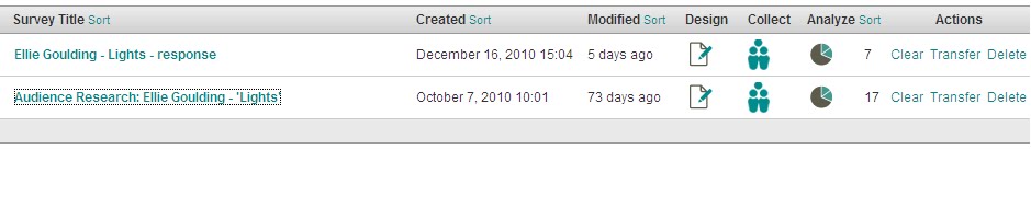
Here is an image of some responses posted on the blog from students from other schools after watching our final video.

4. HOW DID YOU USE MEDIA TECHNOLOGIES IN THE CONSTRUCTION AND RESEARCH, PLANNING AND EVALUATION STAGES?
Our blog was the central focus of all stages of the music video. It allowed us to work collaboratively, posting and sharing ideas and opinions with each other and the teachers. We were able to upload image ideas for shots and any videos that we liked from youtube which had certain aspects such as camera techniques or mise-en-scene.
We also used powerpoint to create pieces of work such as our pitch, then using a website called ‘slideboom’, we could upload the powerpoint and then embed the URL link into the blog. To help inform us for our pitch in terms of audience research, we used surveymonkey to create an online questionnaire, meaning that we could gain ideas from our target audience for our video. We also recorded a video of our animatic and were able to put this on the blog.
In construction, we were able to use new HD cameras to shoot with. This greatly improved the pixel quality of our footage. We also had access to tripods and a dolly to ensure that some camera movement was either static or had smooth movement. We could then capture our footage and use premiere to edit. Premiere allowed us to import our footage and create our music video using different effects and working hard to cut and move the clips precisely. For our digipak and advert, we used photoshop. We used this to adapt and edit any images using different effects, and add font to it.
I used photoshop as shown below to edit photographs and add font for our digipak.


In premiere we rearranged footage and added effects such as the lens flare used in the picture above.
Photoshop - When using photoshop, I adapted original images to create a final piece. I used the crop tool to select the part of the image that i wanted to use. I then changed the lighting settings to black and white and used brightness and contrast levels to create the look I wanted. I decided to use colourful font so that it would stand out and enhance the 'fun' look of the album to stop it looking bland and promoting the artist as a lively and interesting character. On the back of the album, the song titles did not stand out against the background. I decided to add white rectangular shapes using the shape tool to lay on the layer below the text and above the image, making the font bold.
Premiere Elements - In premiere, we loaded all of our footage and filled the timeline with a slightly rough selection of footage, cut down to size, and placed in a vaguely correct order. This then enabled us to move footage around and cut out or add in different parts of footage as we changed our minds or filmed more footage. To change the look of the actual artist we used image control, managing saturation for different looks such as sepia or bright colours, and also adjusted the brightness and contrast. To add special effects we used a number of techniques. We used overlaying to place two images over each other, changing the opacity to translucent so that both images can be seen at the required strengths. This particularly worked when trying to show lights flashing behind the artist in the studio as we overlayed the artist with a shot of a light flashing on and off. We also used tools in premiere such as lens flare which created the light as seen in the image above. We used the luna key to darken the background, which especially worked when showing the artist as duplicated.
No comments:
Post a Comment