Candidate Number: 8021
Evaluation - Questions 1 to 4, audience research included
http://twgsbmedia10a2group3.blogspot.com/2010/12/saskia-evaluation-in-what-way-does-your.html
Animatic
http://twgsbmedia10a2group3.blogspot.com/2010/11/gd-lights-storyboard.html
There is a post named 'Final Cut', yet this is not the final cut as our actual one was taken off youtube for copyright purposes and then the blog would not let us upload the new one.
Wednesday 18 May 2011
Georgina Dicken
Candidate Number; 8010
Evaluation; Questions 1 to 4, audience research included
http://twgsbmedia10a2group3.blogspot.com/2010/12/gd-evaluation.html
Animatic;
http://www.blogger.com/post-edit.g?blogID=7919635751034824494&postID=7407726649791661171
Music Video; Our final piece is not available to watch on the blog due to the video being removed from Youtube due to copyright issues.
Thursday 23 December 2010
GD: Evaluation
In what ways does your media product use, develop or challenge forms and conventions of real media products?
When constructing our video we looked towards other Ellie Goulding videos for our inspiration as we wanted to create a video that would fit into her brand. I was particularly inspired by the videos for ‘Your Song’ and ‘The Writer’ because it shows the artist in natural surroundings and from an audience perspective I feel that I could relate to each individual shot in the video. We took the aspects of the artist being alone and using a variety of natural locations but made them our own by adding special effects and playing on the lighting and colouring of the shots to make our video individual.


Within our video we played with the use of colour. We wanted the audience to build a personal relationship with the artist we did this by letting the audience view the artist at her most vulnerable where she’s simply her self. We used the contrast between the white snow and the dark studio to show the difference between the artists ordinary and extraordinary sides.

How did you use media technologies in the construction and research, planning and evaluation stages?
We used blogger.com to create a collaborative e-portfolio in our group during the planning, construction and evaluation of our three media texts for example, when discussing initial concepts for our video we individually posted examples of existing music videos that we liked certain aspects of and then commented on each others videos and said what we liked or didn't like to help create and understanding of the effects and images we wanted to have in our own video. The blog has been a major part of the videos preparation and construction. On the blog we are able to post our pitch (slideboom), storyboard (animatic) as well as photos and clips of any reccies that we have undertaken which illustrates our creative thoughts throughout the video filming and editing process

By using Adobe Premiere I constructed an animatic of each individual frame that we wanted to film and include in our video. Although the animatic was useful in the initial stages of filming the video when it actually came round to filling out the storyboard with shots that we had filmed we found ourselves steering away from out planned layout because the shots didn't look visually appealing or the shots we planned were either to static or the cutting rate was too long.
ICT helped us to reach an audience and made it easy for them to communicate their initial thoughts and ideas. By using Survey Monkey we were enable to discuss our initial ideas for the video with our target audience as well as finding out what our video consumer would want to see in our video and this therefore this helped us in deciding our key locations, costumes and artist appearance.

We were able to use other packages such a Slide Boom which enabled us to post our video pitch on our blog. This then shows how far we have come from a few initial ideas to a full promotional music video for an artist. It also enabled us to show our perspective audience our initial ideas for the video.
In Adobe Photoshop i manipulated my image for the advert by turning the background only of the original image from colour to black and white. I did this by using the lasso tool to select around the artist and the balloon so that it would remain in colour and therefore contrast against the black and white background making the artist one of the main focuses in the advert. I also used the lasso tool to simply select the balloons so that I could adjust the saturation and hue to alter the colours of the balloons so i could create an effective reading path. Other effects that I used in the advert were using different brushes, colour pick tool and the blur/smudge tool to name a few.

When constructing our video we looked towards other Ellie Goulding videos for our inspiration as we wanted to create a video that would fit into her brand. I was particularly inspired by the videos for ‘Your Song’ and ‘The Writer’ because it shows the artist in natural surroundings and from an audience perspective I feel that I could relate to each individual shot in the video. We took the aspects of the artist being alone and using a variety of natural locations but made them our own by adding special effects and playing on the lighting and colouring of the shots to make our video individual.
Within our video we played with the use of colour. We wanted the audience to build a personal relationship with the artist we did this by letting the audience view the artist at her most vulnerable where she’s simply her self. We used the contrast between the white snow and the dark studio to show the difference between the artists ordinary and extraordinary sides.

Our music video challenges the dominant ideology of young women today as it is often expected now for younger artists to use their image and sexuality to sell their records however our artist follows different conventions and appeals to her audience by appearing down to earth and has a ‘normal’ appearance which would endear an audience to her music and persona. In our music video the artist is put in a position of empowerment because the video focus solely on the artist and therefore the audience are focusing on her for the length of the track.
Goodwin's Framework …
Goodwin says how a music video is a sequence of clips edited together where the music is made visual with either links between the visuals and lyrics, first person mode of address and voyeurism. Our video responds to all of these frameworks as described below
- link between visuals and lyrics
o “The strength I need to push me”
o “dreaming when there gone”
- first person mode of address
o digetic gaze at the end of the video
- voyeurism
o the idea of having a look into the artists life.
- through beats and synaethesia
o the actress in our video made the link between the artist and the song as her tone of voice matched the audiences expectations

The use of mise-en-scene was used to create meaning to video that the audience could relate to. All the different costumes, make up and props that were used in the video could all be accessed by the audience. This was done intentionally to make the artist appear down to earth and accessible to the audience which makes her likable. By using locations or mise-en-scene that can be related to the audience creates the meaning that the artist hasn’t lost touch of the life that she had before she became a star.
How effective is the combination of your main product and secondary texts?
The artists brand is simple, she is simply a young attractive girl who is quite content with her self and doesn’t rely on others for her happiness. The brand fits in with the genre of the music in the fact that it is innocent and it isn’t there be controversial or to offend anyone. However I think the brand is also rebelling against the usual for a young female artist as she is not usual her sexuality to sell records but her raw vocal talent.
The advertisement was designed to run in 'Q' Magazine because although the genre of the music featured is still of an indie genre it's more mainstream and has pop tone to it, rather than 'NME' which focuses on new and bands which have a very niche target audience. Other artists that feature in 'Q' magazine are Florence and the Machine, Eliza Doolittle and Lily Allen who all have a similar sound to our tracks artist Ellie Goulding. From the advert I decided to use colour to attract the audience’s attention, by making the decision to have the background black and white this would make any other colour on the advert pop and grab the readers attention because of the stark contrast.
The text used in my advert for Ellie Goulding's album reinforces the image that we wanted to create for the artist because the font that I chose for the artists name is feminine whereas in comparison to the font used for the album name which is more strong and bold this reinforces that although the artist has a vulnerable side she is also strong willed and could hold her own in the world which also puts out a strong message to the audience as well.

Dyer says how fans will want to recreate an artist’s brand image. I think that our three texts create an image that fans will want to mirror, this is possible to do a because the artist has a style that the target audience of teenage girls can relate to and can mirror however it will always be a signature part of the artists star persona. Dyer also says that the artist needs to be both ‘ordinary and extraordinary’ this is constructed though our three texts because the artist is pictured in everyday surroundings where she could appear to have the same vulnerability as the consumer watching the video however the artist is also made to look more extraordinary as she is filmed in a studio with lights where all the attention is focused on her which gives her that additional glamour to an everyday girl.
What have you learned from your audience feedback?
The target audience for our music video is both young male and females however we don't want to video to alienate the artist from the older generations by making it to youthful. We wanted to create something that any generation could enjoy but it was particularly aimed towards teenagers.
It was very important to test our initial concept to our target audience because if we created a video that did not appeal or was not enjoyed by the audience then there is chance that the audience would distance themselves from the artist and not watch or buy the artist music and because the music video is a promotional aid it would damage the artists reputation.
The primary research that we gathered from both our class discussions and from Survey Monkey reconfirmed many of our original ideas. We needed to include ...
- a variety of locations
- actress needs to have a ‘fresh’ appearance
- casual dress
- mixture of lip synching and 'casual' shots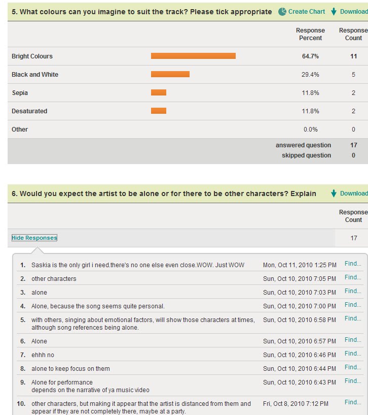

We showed our class our rough cut for the video, the main thing we achieved from our rough cut feedback was that our individual shots were too long and that we needed to have a much faster cutting rate. Apart from that the initial response was a positive one. We took this constructive criticism and we made the individual shots quicker as well as filming new locations with movement to break up the video to make it less dull.
Our video was made to be consumed through both focused viewing and ambient viewing. Our hope is that fans of the artist would go out of their way to view the video on YouTube because they like the video and find that it has a repeatability factor however I believe that the video would also be viewed casually via music channels whether this is done individually or with social groups.
The final cut of our video was watch by other A2 Media Students from another school, their feedback all shared three main points;
- They liked the use of special effects
- The link between locations and colours
- However the cutting rate could still be faster

How did you use media technologies in the construction and research, planning and evaluation stages?
We used blogger.com to create a collaborative e-portfolio in our group during the planning, construction and evaluation of our three media texts for example, when discussing initial concepts for our video we individually posted examples of existing music videos that we liked certain aspects of and then commented on each others videos and said what we liked or didn't like to help create and understanding of the effects and images we wanted to have in our own video. The blog has been a major part of the videos preparation and construction. On the blog we are able to post our pitch (slideboom), storyboard (animatic) as well as photos and clips of any reccies that we have undertaken which illustrates our creative thoughts throughout the video filming and editing process

By using Adobe Premiere I constructed an animatic of each individual frame that we wanted to film and include in our video. Although the animatic was useful in the initial stages of filming the video when it actually came round to filling out the storyboard with shots that we had filmed we found ourselves steering away from out planned layout because the shots didn't look visually appealing or the shots we planned were either to static or the cutting rate was too long.
ICT helped us to reach an audience and made it easy for them to communicate their initial thoughts and ideas. By using Survey Monkey we were enable to discuss our initial ideas for the video with our target audience as well as finding out what our video consumer would want to see in our video and this therefore this helped us in deciding our key locations, costumes and artist appearance.

We were able to use other packages such a Slide Boom which enabled us to post our video pitch on our blog. This then shows how far we have come from a few initial ideas to a full promotional music video for an artist. It also enabled us to show our perspective audience our initial ideas for the video.
In Adobe Photoshop i manipulated my image for the advert by turning the background only of the original image from colour to black and white. I did this by using the lasso tool to select around the artist and the balloon so that it would remain in colour and therefore contrast against the black and white background making the artist one of the main focuses in the advert. I also used the lasso tool to simply select the balloons so that I could adjust the saturation and hue to alter the colours of the balloons so i could create an effective reading path. Other effects that I used in the advert were using different brushes, colour pick tool and the blur/smudge tool to name a few.
To edit the video we used Adobe Premiere although this is the basic tool the edit and cut the video I used several special effects to create some extraordinary aspects of the video. I added in two lens flares to turn a static shot into something more interesting and aesthetically appealing for the lyrics "the strength I need to push me" as by selecting certain key frames I was able to make it look as if the artist is pushing away the light. During the editing I also included reverse time to some of the shots in the snow and with the balloons. Finally during the studio shots I lowered the opacity and layered the previously dull shots and put filler shots behind the artist which not only created movement but added more colour to the artist and made it more interesting.
Saskia, Evaluation,
1. IN WHAT WAY DOES YOUR MEDIA PRODUCT USE, DEVELOP OR CHALLENGE FORMS AND CONVENTIONS OF REAL MEDIA PRODUCTS?
GOODWIN

1. ‘Through beats’ or synaethesia – In our music video, there is a fair amount of lip synching where the lyrics match exactly to the artists visuals. We managed to make the singing seem realistic as the actress matched the stereotypical image of that certain grain of voice, a young female. Key phrases and lines are enhanced as most of them are lip synched, with the remaining lyrics that are not so relevant having slight disjuncture between lyrics and visuals.


4. Lighting and colour – we have used lighting to emphasise an emotional performance in the studio where the only thing shown is the artist and their performance with no distractions in the background. We also use strong and bright colours in the outside locations to add interest.


2. HOW EFFECTIVE IS THE COMBINATION OF YOUR MAIN PRODUCT AND ANCILLARY TEXTS?
The artist is portrayed as unique, individual and independent. This is shown through our video, the digipak and the advert. In all three texts, the artist is shown alone. This enhances the idea that she is independent, possibly as both an artist and a person. In the video she is either smiling or showing strong emotions through facial expressions or body language. In the other texts, the artist is either smiling or adopting a strong and meaningful position, again through the use of body language or facial expression in mid close-ups.
Dyer – We have used a variety of close-ups in the video to create para-social intimacy. This means that the consumer is repeatedly able to view the star in detail. The star, in turn through the extra-diegetic gaze, makes a connection with the audience. The audience then want to watch the artist repeatedly and they may also take an interest in their old or new albums, singles and videos.
Dyer states that the star ‘must be simultaneously ordinary and extraordinary for the consumer’. Through the video, the stars life is portrayed as fairly ordinary in many ways such as the ordinary task of walking a dog. Yet, being shown singing in the studio and in a number of locations shows extraordinary detail in the artist and captures the intimacy of their life for the audience to view and consume. The star must also be ‘simultaneously present and absent for the consumer’. In editing, we used close-ups where the artist is predominantly present, yet also shots such as long or mid shots where the artist is not facing the camera and is absent. This creates an incoherent message for the consumer and they therefore seek more products such as new singles, albums or music videos to complete the image.

Examining the digipak
I would consider this digipak as effective. Although a number of different locations have been used, there is a clear link as all the photographs are in black and white. To add to the postmodern sense, the colourful font brightens the digipak and makes it and the artist seem playful. The artist is present predominantly on the front with a mid close-up which draws the consumer to purchasing the product. She is then slighly less present on the back cover as she is not actually looking towards the camera. In the inside pannels the artist is far away or just her feet can be seen. This has made the artist absent leaving the consumer wanting more and to consume the artists music.
3. WHAT DID YOU LEARN FROM YOUR AUDIENCE FEEDBACK?


Here is an image of some responses posted on the blog from students from other schools after watching our final video.

4. HOW DID YOU USE MEDIA TECHNOLOGIES IN THE CONSTRUCTION AND RESEARCH, PLANNING AND EVALUATION STAGES?
Our blog was the central focus of all stages of the music video. It allowed us to work collaboratively, posting and sharing ideas and opinions with each other and the teachers. We were able to upload image ideas for shots and any videos that we liked from youtube which had certain aspects such as camera techniques or mise-en-scene.
We also used powerpoint to create pieces of work such as our pitch, then using a website called ‘slideboom’, we could upload the powerpoint and then embed the URL link into the blog. To help inform us for our pitch in terms of audience research, we used surveymonkey to create an online questionnaire, meaning that we could gain ideas from our target audience for our video. We also recorded a video of our animatic and were able to put this on the blog.
In construction, we were able to use new HD cameras to shoot with. This greatly improved the pixel quality of our footage. We also had access to tripods and a dolly to ensure that some camera movement was either static or had smooth movement. We could then capture our footage and use premiere to edit. Premiere allowed us to import our footage and create our music video using different effects and working hard to cut and move the clips precisely. For our digipak and advert, we used photoshop. We used this to adapt and edit any images using different effects, and add font to it.
I used photoshop as shown below to edit photographs and add font for our digipak.


In premiere we rearranged footage and added effects such as the lens flare used in the picture above.
GOODWIN
Goodwin claims that a good music video is a sequence of clips edited together that responds to the pleasure of music, and in which that music is made visual, either in new ways or in ways that accentuate existing visual associations.
1. ‘Through beats’ or synaethesia – In our music video, there is a fair amount of lip synching where the lyrics match exactly to the artists visuals. We managed to make the singing seem realistic as the actress matched the stereotypical image of that certain grain of voice, a young female. Key phrases and lines are enhanced as most of them are lip synched, with the remaining lyrics that are not so relevant having slight disjuncture between lyrics and visuals.
2. Narrative and performance – We decided to avoid a classic realist narrative in our video. There is already a slight sense of ambiguity when listening to the lyrics of the song and we felt that the video would work better with a slight disjuncture between the lyrics and the visuals so that there are links, but there is no complete narrative told. This adds interest making the video unique, yet also maintains a sense of repeatability.
3. Star Image – We created our image by using the stereotypical representation of an indie pop artist. The artist has a unique dress style which doesn’t conform to the typical glam pop star, yet is individual. This is typical of Indie artists and by watching some of Ellie Goulding’s previous videos; we were able to incorporate some of her costume ideas into our video.

4. Relate visuals to the song – Our video does not illustrate a literal meaning, and there is not complete disjuncture between the visuals and the song. It is most probably an example of amplification. We have amplified the original song’s meaning and effect, yet adapted the visuals to our understanding of the lyrics. The understanding of the lyrics is fairly vague as there are a number of different interpretations. Through our visuals and the number of varying locations used, we aimed to portray the ordinary life through the field and in the snow, and the extraordinary life of the artist in the studio and with the lights.
5. Technical aspects
1. Tempo – the artist is moving in most of the shots, and so is the camera. This motivates the video and allows it to flow. Our cutting rate is fast paced in some parts, perhaps meaning that the video could not be completely understood when watching once, adding repeatability. We also use effects such as enhancing colours to add interest so that the video is not dull and is appealing to the audience.


2. Meat – we know that meat shots are important as close-ups allow emotions to be conveyed as the audience can see expressions on the artist’s face. The voice is also seen as the most important part of pop music and these shots allow the audience to relate the voice to the artist.
3. Beats – we try to convey the beats of the music in our cutting rate. The cutting rate is fast paced, yet it slows and increases when the beat of the music quickens or slows down.

4. Lighting and colour – we have used lighting to emphasise an emotional performance in the studio where the only thing shown is the artist and their performance with no distractions in the background. We also use strong and bright colours in the outside locations to add interest.
5. Mise-en-scene – We used a variety of scenic locations and ensured that the costume and make-up of the artist was conventional of an Indie artist. This added authenticity and interest.
-----------------------------------------------------
SEMIOTICS
Social myths - our artist is portrayed as independent. She is alone throughout the video, and although in parts, the person filming could be seen as a person in the actual video through the notion of looking and how the artist laughs and smiles at the camera, there is no other seen person in the video. The fact that she is alone therefore connotes independence. It conforms to the emergent ideology that women are becoming independent and are strong without men or anyone else. This is different to the residual ideology in the past that men were dominant and women were merely seen as sexual objects. This sense of independence shown and a strong personality through performance make the artist unique and could also be a role model to many young girls watching the video that look up to the popular artist.

Visual and linguistic signs – In terms of iconic signs, our advertisement portrays the nature of the artist and the video. The balloons signify that the artist and the video are playful and postmodern in form. This would be appealing to young audiences who look up to artist like Ellie Goulding who are independent and unique.

Relation of signs – In the digipak, the artist is in different locations. The snow, field and being in front of a wall giving an urban feel all in a way contrast with each other adding depth to the life of the artist. They are all different and give her a sense of strong personality and interest.
Indexical sign- Ideological valued qualities are shown in the three texts through the mise-en-scene. The artist is well dressed conforming to shared common values and preferences of fashion. This is appealing to young or slightly older females as they may aspire to be like the artist, although it also aims to attract males.
--------------------------------------------------
POSTMODERNISM
Postmodern texts often seem less serious and more playful. The fact that the artist is almost ‘playing up to the camera’, laughing, and playing with a dog, demonstrates this playfulness and entertains the audience. They also tend to chop things up and rearrange them. As we do not have a set narrative, we have taken different shots from different locations that are muddled together purposefully and carefully positioned to make sense, yet add interest and originality. Postmodernism looks to avoid anything that provides an answer to all life’s problems. Our video is similar to this in that it does not present or solve problems, just portrays aspects of the artists life and her emotions.
2. HOW EFFECTIVE IS THE COMBINATION OF YOUR MAIN PRODUCT AND ANCILLARY TEXTS?
The artist is portrayed as unique, individual and independent. This is shown through our video, the digipak and the advert. In all three texts, the artist is shown alone. This enhances the idea that she is independent, possibly as both an artist and a person. In the video she is either smiling or showing strong emotions through facial expressions or body language. In the other texts, the artist is either smiling or adopting a strong and meaningful position, again through the use of body language or facial expression in mid close-ups.
Dyer – We have used a variety of close-ups in the video to create para-social intimacy. This means that the consumer is repeatedly able to view the star in detail. The star, in turn through the extra-diegetic gaze, makes a connection with the audience. The audience then want to watch the artist repeatedly and they may also take an interest in their old or new albums, singles and videos.
Dyer states that the star ‘must be simultaneously ordinary and extraordinary for the consumer’. Through the video, the stars life is portrayed as fairly ordinary in many ways such as the ordinary task of walking a dog. Yet, being shown singing in the studio and in a number of locations shows extraordinary detail in the artist and captures the intimacy of their life for the audience to view and consume. The star must also be ‘simultaneously present and absent for the consumer’. In editing, we used close-ups where the artist is predominantly present, yet also shots such as long or mid shots where the artist is not facing the camera and is absent. This creates an incoherent message for the consumer and they therefore seek more products such as new singles, albums or music videos to complete the image.
Examining the digipak

I would consider this digipak as effective. Although a number of different locations have been used, there is a clear link as all the photographs are in black and white. To add to the postmodern sense, the colourful font brightens the digipak and makes it and the artist seem playful. The artist is present predominantly on the front with a mid close-up which draws the consumer to purchasing the product. She is then slighly less present on the back cover as she is not actually looking towards the camera. In the inside pannels the artist is far away or just her feet can be seen. This has made the artist absent leaving the consumer wanting more and to consume the artists music.
Examining the advert
The advert is also effective as it is extremely playful, fun and postmodern. The bright colours are attractive and would draw attention to audiences. There is a clear and strong leading line as the artists arm reaches up to the name of the artist and the other then slightly points down towards the name of the album.
3. WHAT DID YOU LEARN FROM YOUR AUDIENCE FEEDBACK?


The target audience for the album/artist is mainly fairly young girls and boys. It may also be attractive for slightly older audiences but our main focus is on the younger generation. It was important to test our concept in pre-production to an audience as it enabled us to receive valuable feedback and perspectives on our ideas and also provide us with new and innovative ideas that we had not thought of.
First, we played the song to our media class. We already had a rough concept idea in mind, but they helped inform our idea by telling us what sprung to mind when listening to the track. We also created a questionnaire on survey monkey to ask specific questions about the track.
Once we had used these ideas and progressed with our concept, we pitched our idea to the class. They then responded to our idea and also asked questions which gave us new possible problems to think about. One problem was that the artist would not be lip synching in the studio. Our idea then completely turned around and in filming we ended up filming the majority of our footage In the studio with the artist lip synching.
In later stages, when we had begun shooting and editing our footage, we showed a rough cut to the class. The main issue that they had with it was that the cutting rate was not fast enough. We overcame this by chopping up clips and rearranging them, yet we still needed more footage. This is why we shot more in the studio and when it snowed it was a perfect opportunity to go out and shoot more.
Finally, when our video was complete, we showed it to the class and uploaded it to youtube for audiences to watch and either comment on the blog or fill in a survey we created on surveymonkey.
Our video is open to both focused and ambient viewing. Ellie Goulding is a popular artist and some of her songs may be played on music channels or on the radio. Our advert is bright and attention catching and this could catch audiences attention and make them want to watch the video in a focused manner on youtube and consume the album.
Here is an image of some responses posted on the blog from students from other schools after watching our final video.

4. HOW DID YOU USE MEDIA TECHNOLOGIES IN THE CONSTRUCTION AND RESEARCH, PLANNING AND EVALUATION STAGES?
Our blog was the central focus of all stages of the music video. It allowed us to work collaboratively, posting and sharing ideas and opinions with each other and the teachers. We were able to upload image ideas for shots and any videos that we liked from youtube which had certain aspects such as camera techniques or mise-en-scene.
We also used powerpoint to create pieces of work such as our pitch, then using a website called ‘slideboom’, we could upload the powerpoint and then embed the URL link into the blog. To help inform us for our pitch in terms of audience research, we used surveymonkey to create an online questionnaire, meaning that we could gain ideas from our target audience for our video. We also recorded a video of our animatic and were able to put this on the blog.
In construction, we were able to use new HD cameras to shoot with. This greatly improved the pixel quality of our footage. We also had access to tripods and a dolly to ensure that some camera movement was either static or had smooth movement. We could then capture our footage and use premiere to edit. Premiere allowed us to import our footage and create our music video using different effects and working hard to cut and move the clips precisely. For our digipak and advert, we used photoshop. We used this to adapt and edit any images using different effects, and add font to it.
I used photoshop as shown below to edit photographs and add font for our digipak.
In premiere we rearranged footage and added effects such as the lens flare used in the picture above.
Photoshop - When using photoshop, I adapted original images to create a final piece. I used the crop tool to select the part of the image that i wanted to use. I then changed the lighting settings to black and white and used brightness and contrast levels to create the look I wanted. I decided to use colourful font so that it would stand out and enhance the 'fun' look of the album to stop it looking bland and promoting the artist as a lively and interesting character. On the back of the album, the song titles did not stand out against the background. I decided to add white rectangular shapes using the shape tool to lay on the layer below the text and above the image, making the font bold.
Premiere Elements - In premiere, we loaded all of our footage and filled the timeline with a slightly rough selection of footage, cut down to size, and placed in a vaguely correct order. This then enabled us to move footage around and cut out or add in different parts of footage as we changed our minds or filmed more footage. To change the look of the actual artist we used image control, managing saturation for different looks such as sepia or bright colours, and also adjusted the brightness and contrast. To add special effects we used a number of techniques. We used overlaying to place two images over each other, changing the opacity to translucent so that both images can be seen at the required strengths. This particularly worked when trying to show lights flashing behind the artist in the studio as we overlayed the artist with a shot of a light flashing on and off. We also used tools in premiere such as lens flare which created the light as seen in the image above. We used the luna key to darken the background, which especially worked when showing the artist as duplicated.
Friday 17 December 2010
Group: Final Cut
Below is the final cut of our music video. However due to copyright issues the soundtrack has been removed from the video.
'>http://www.youtube.com/v/qaax2NCRRKU?fs=1&hl=en_GB"> name="allowFullScreen" value="true">
'>http://www.youtube.com/v/qaax2NCRRKU?fs=1&hl=en_GB"> name="allowFullScreen" value="true">
Thursday 16 December 2010
GD: Call Sheets, Risk Assessments and Camera Hire
Below are some of the Call Sheets, Risk Assessments and Camera Hire sheets we had to complete as a group in order to hire out the camera equipment to film for our video.


Subscribe to:
Posts (Atom)